Fat finger is a big fat problem for mobile users. It’s the source of much frustration, and the reason for numerous recommended design and writing practices.
For years most people have been using a mouse, driving a handful of plastic until a fine pointer touches a link on the screen. We remotely control a wee arrow over the screen, aiming for some blue text or a Buy! button, and then, when we’re on target, we’ll pause for a little think. “Will I? Won’t I? Maybe. OK. Go for it.” And only then do we click.
With a mouse in our fist we feel pretty much in control.
That is worlds away from the mobile experience. By comparison, activating links on a mobile screen can feel like playing a piano in sheepskin mittens. We touch a tiny screen with a big fat finger and wham, we’re instantly elsewhere. Or we aim and miss and try again: tedious. A stylus is not much improvement.
Links are one of the main tools for interaction on a desktop. But apps for smartphones and tablets have many different faculties for interaction — for example, swipes and pinches.
On a mobile web site, we can still make links easier for the user. Design is massively important but writers can also do a lot to help.
Upside: at last we might see the demise of “click here!”, as it makes no sense on mobile. Mobile people are tapping and touching links, not clicking, and they don’t need a finger-aerobics instructor.
Nope. They just need you, as a web or intranet content author, to do a simple test.
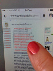
- Look at your link.
- Look at your finger. Fit or fat?
Writing tip: Mobile-proof your hyperlinks
The problem with links on mobile devices is the human finger: it’s much bigger than the cursor we use on a desktop.
So make all links obvious and large and not too close to other links.
- An easy target is a big, isolated target. (Even on a desktop, a big target gets more action.)
- Use big action buttons, with plenty of space around.
- Have plenty of space either above or below every text link.
- Links in a list are no good on mobile unless you leave a line between each one.
- Use a big font for headlines that are links.
- Don’t be afraid of long headlines: they work fine on mobile.
P.S. By the way, Read more after a summary or taster always was bad for usability, accessibility and search. As a short piece of link-text buried at the end of a paragraph, it’s even worse on a mobile. If you’re stuck with Read more in your template, at least make every headline an active link to the full article.
Leave a comment: